Brand development and website design
Role
Lead digital designer
Responsibilities
Brand development, UX research, UI design
Background
The Compensation Scheme of Last Resort (CSLR) is a newly established scheme helping victims of financial misconduct receive compensation, which was previously unavailable to them.
As a new entity, CSLR needed both a brand and a website.

Discovery
In order to understand the client’s needs, I, alongside our digital content lead, facilitated a number of discovery sessions and interactive workshops with key stakeholders.
As a brand, CSLR required to be distinctively different from the Australian Financial Complaints Authority (AFCA), an independent dispute resolution service. Serving a different function within the financial sector, they did not wish to be confused.
Meanwhile, interactive workshops helped identify key audiences, top tasks and user journeys. This resulted in an understanding of the user groups, the process, but most importantly and perhaps unexpectedly, the breadth and importance of emotions felt along the way.
We established that the solution needed to:
- Be distinctively different to AFCA.
- Be hopeful and positive as a brand, making users feel safe and welcome.
- Present complex content in a clear and accessible manner.
- Ensure an intuitive layout and navigation, enabling users to understand CSLR’s process and find information they need easily.
 1.jpg)
Solution
Brand development
As the lead digital designer on this project, I was invited to collaborate with the creative team on the branding process.
Despite the seriousness of CSLR’s role, we were able to get quite creative and fun with the brand to meet the objective of a hopeful, welcoming brand.
We explored the concept of a last resort and giving people one last chance. People in a tough situation sending out a signal for help led to proposing the idea of morse code.
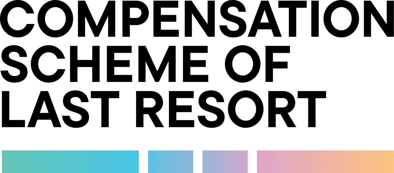
The dots and dashes visible in the logo is the short-hand morse code for ‘full stop’ which is a nod to CSLR being the final point of resolution.
In difficult situations, people don't want ambiguous acronyms. So the decision to use the organisation’s full name was made, to better describe what they do.
Finally, a soft pastel gradient was applied to the morse pattern, signifying a light at the end of the tunnel and inspiring hope in a difficult situation.

Website
To achieve the website's objectives, the claimant—the primary user—was central to all design decisions. Special attention was given to their emotional states throughout CSLR’s process which could range from stress and frustration to hope and resolution.
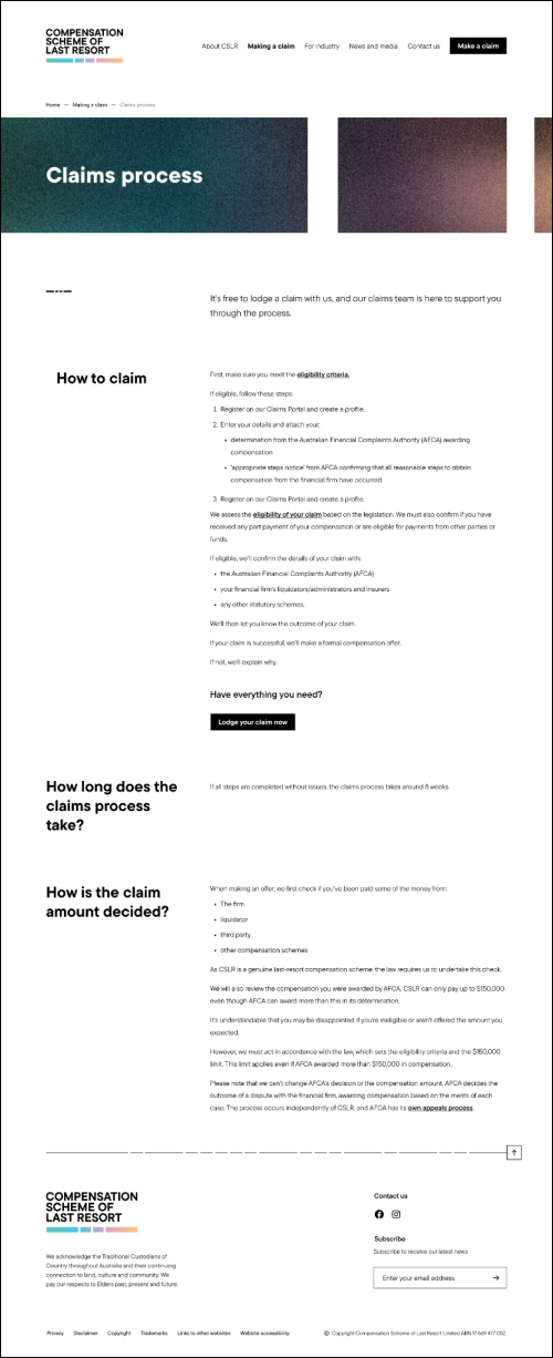
From content to UI, every detail of this website was considered with the goal of reducing cognitive overload. A smooth, simple journey from landing on the site to submitting a claim.
A content audit alongside the workshop activities allowed our content team to establish an intuitive information architecture, and simplify the client's content into plain English.
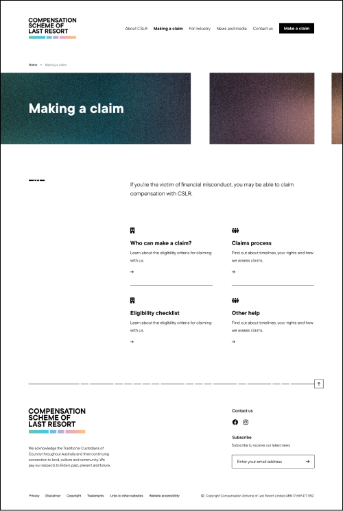
Simplicity was key for the typography, headings were placed to the left of the page for easy scanning of content, with the relevant content placed to the right.
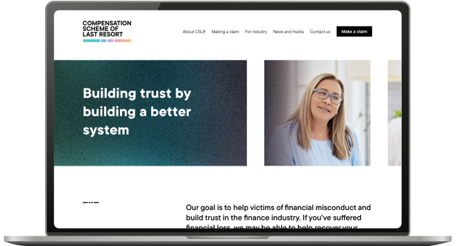
The website’s interface is clean with plenty of white space, big bold headings and most content presented in black and white. Brand colours were used sparingly, to prompt action or where content called for a warm and welcoming tone.
To tie it all together, we applied elements of the brand graphics, using the morse pattern in the top banners and as an embellishment where body copy has no heading.
Collaborating closely with CSLR, both the brand and website launched successfully, and on time. The result is a modern, user-friendly website set to support victims of financial misconduct and build trust within the financial sector.
 2.jpg)


