Website Design
Role
Lead UI designer
Responsibilities
UX research, UI design
Background
Parramatta Artists Studios (PAS) is a creative hub based in Western Sydney, Australia. It offers professional studio spaces, residencies, and development programs for visual artists at various stages of their careers.
Housing only a single page within the broader City of Parramatta website, PAS wanted to expand their online presence with a microsite of their own.

Discovery
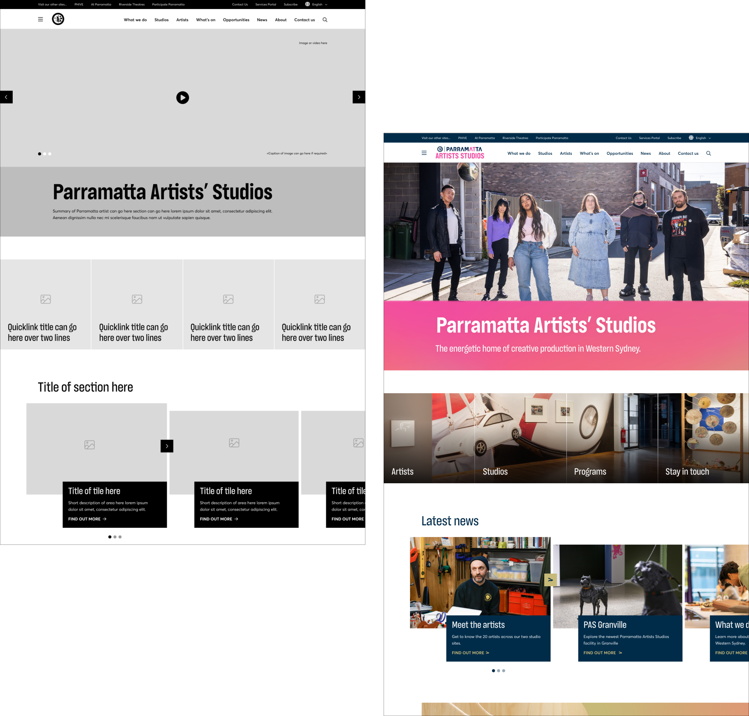
After collaborating with another designer on the low-fidelity wireframes, I assumed leadership of the UI and brand application.
Meeting with the client to understand their vision for the website, I established the solution needed to:
- Maintain enough similarity to the parent site to feel familiar.
- Apply distinct branding elements to give the website its own unique identity.
- Ensure the website is fun and artistic, reflecting the creative nature of the organisation.
I explored a number of different applications of the brand, working through multiple iterations before arriving at the final solution.

Solution
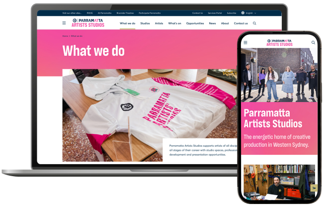
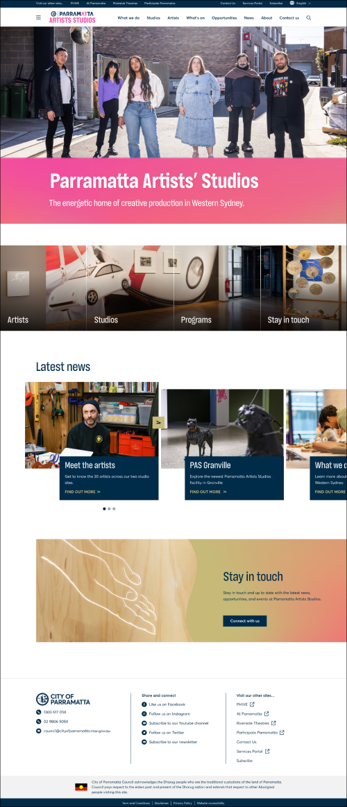
The final solution featured playful but subtle hints of the brand to invite users to explore the site.
PAS gradients were used to add depth, with a specific focus on two of the brand’s colours: pink and gold.
To create a sense of cohesion, the ‘A’ graphic within the PAS logo was incorporated in place of classic chevrons, seen on the ‘next’ and ‘dropdown’ buttons. This application aligns with design elements seen across the other Parramatta micro-sites.
The PAS ‘A’ curve was also incorporated in call-out tiles, replacing the standard straight line.

For the purpose of familiarity and ensuring the website maintains a balanced look and feel against the brand’s bright colours, tiles were kept dark blue, as seen on the Parramatta Town Hall website.
Finally, for readability, all colour combinations were tested to ensure colour contrast meets a minimum of WCAG AA accessibility.
The final product successfully met the client's goals for the website, providing users with an intuitive, accessible, and visually engaging experience.


 copy.jpg)
 copy.jpg)