Brand development and website design
Role
Lead digital designer
Responsibilities
Brand development, UI design
Background
Free Sauce is a lifestyle business mixing open source with tech consulting, the brief required a loose and flexible brand that was professional with a sense of satire.
Discovery
In order to execute this project, I sat down with Free Sauce's founder to understand his vision for the brand and business.
The idea behind Free Sauce stems from a commitment to open source, with the name itself being a play on free and open source code. But beyond advocacy, Free Sauce operates as a professional consulting service delivering real-world solutions for clients, particularly in the government sector.
This dual nature led us to one central design goal, balancing professionalism and personality, and two objectives:
- From a professional perspective (objective One), we were after a clean, minimal design that was simple to navigate.
- From a personality perspective (objective Two), we aimed to combine the founder's love of photography, commitment to open source, and a subtle homage to vintage aesthetics.
Solution
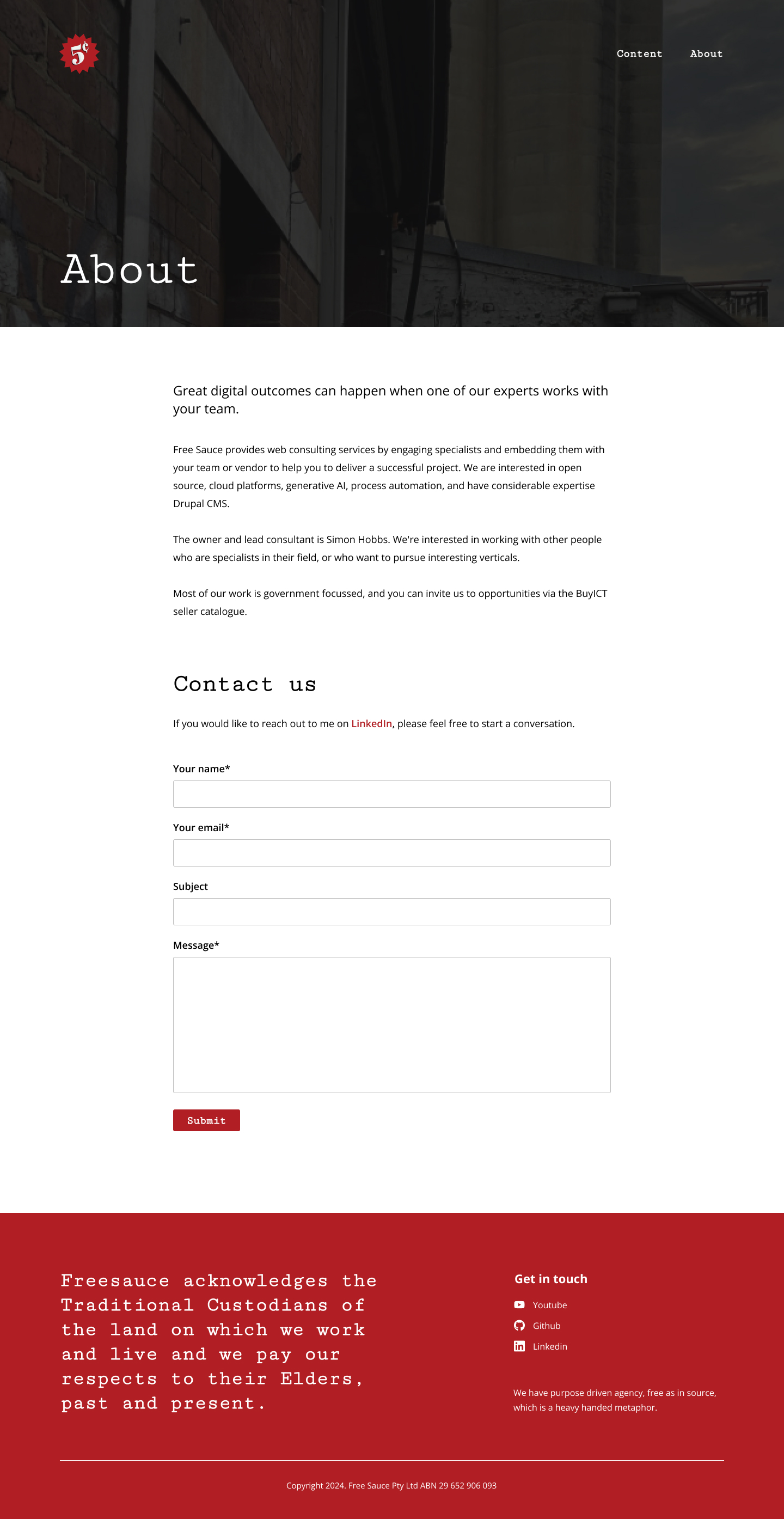
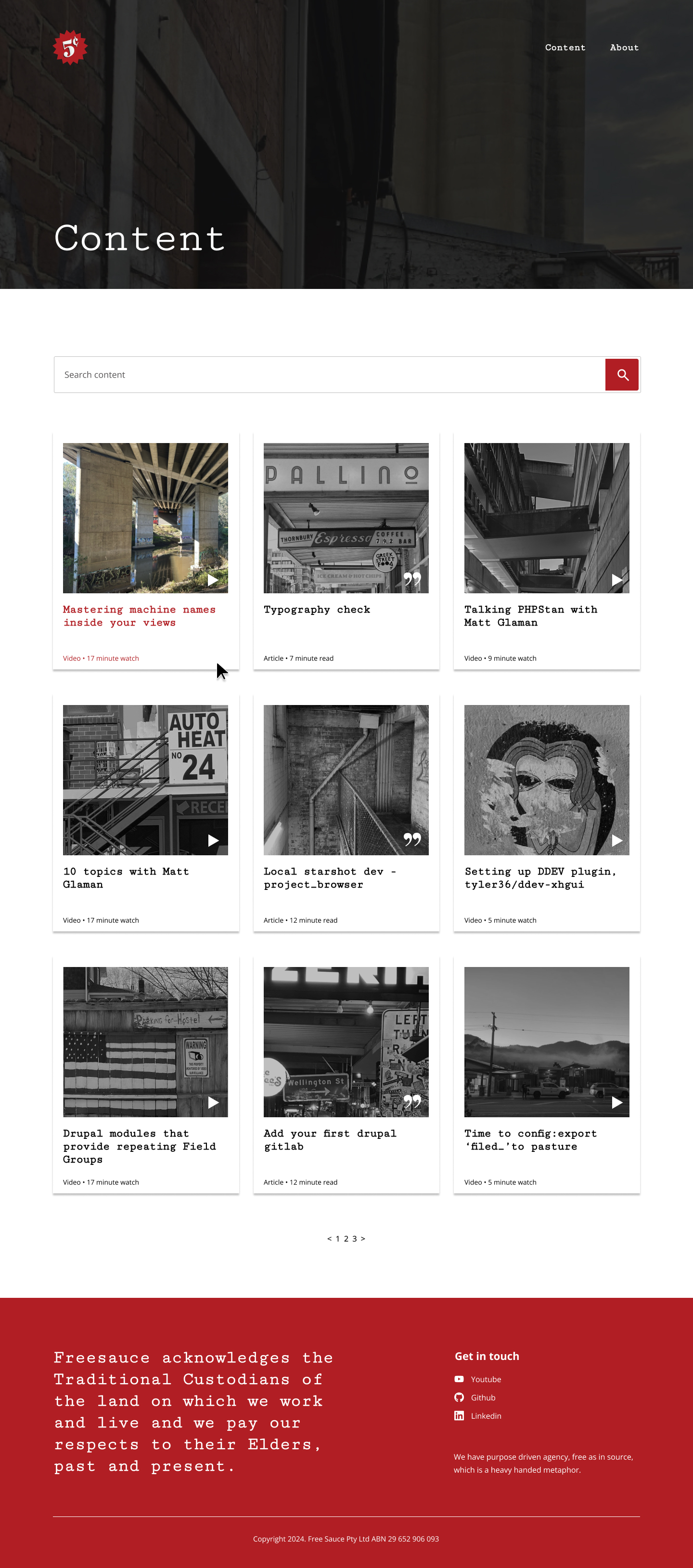
To achieve the first objective, I focused on creating a clean and simple layout with clear headings, uncluttered banners, a simple navigation of two items and plenty of white space.
Objective Two gave space for creative freedom to shine, allowing the brand’s personality to come through in the use of colour, typography, and visual details.
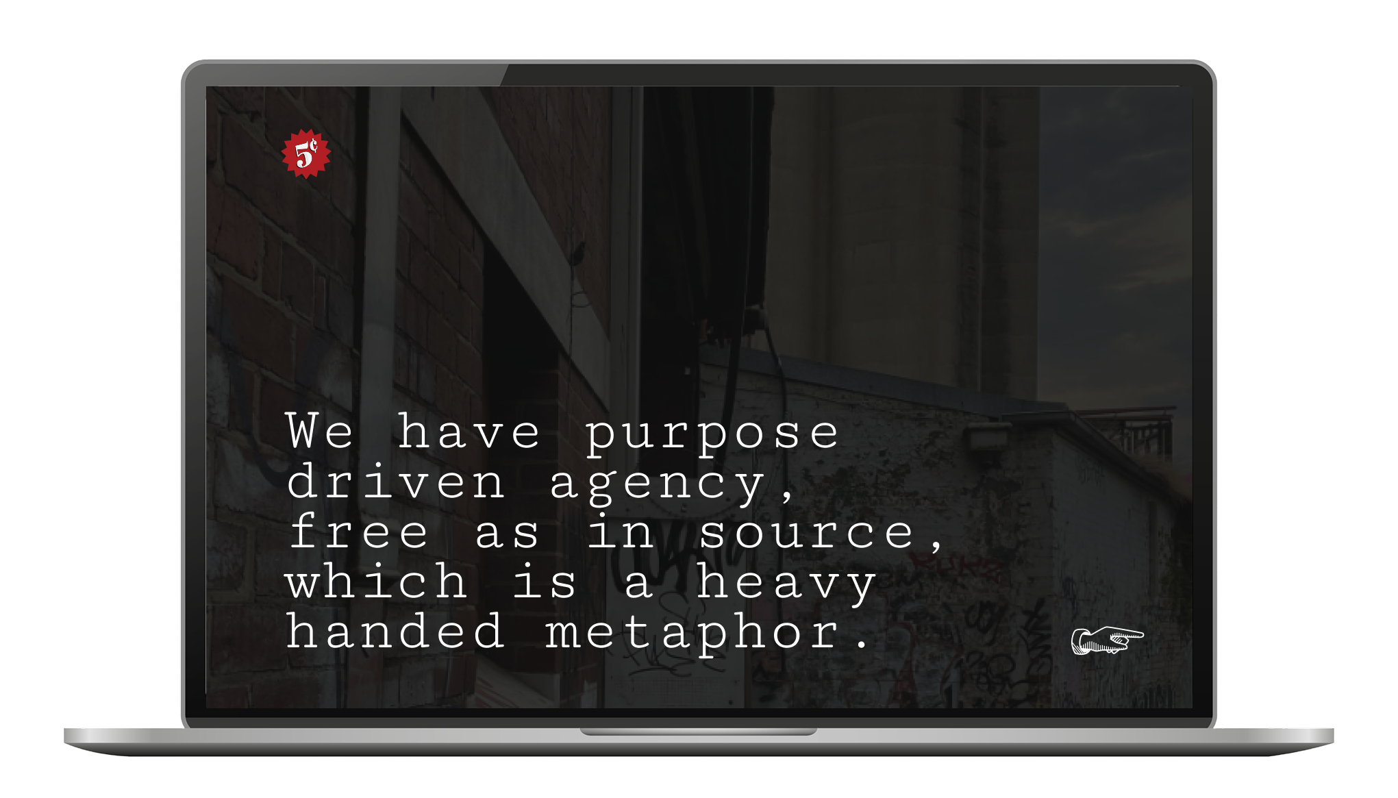
Cutive Mono serves as the brand’s primary typeface, used for headings and buttons throughout the site. Its serif, monospaced design reflects the look and feel of both vintage typewriters and modern code editors such as Visual Studio Code.
The brand’s primary colour, a bold red, a nod to the tomato sauce–inspired name and vintage 5¢ sticker logo, was applied sparingly to hover states and buttons. In contrast, dark backgrounds were applied to banners to further mimic code editors and stand out against the white space of the content.
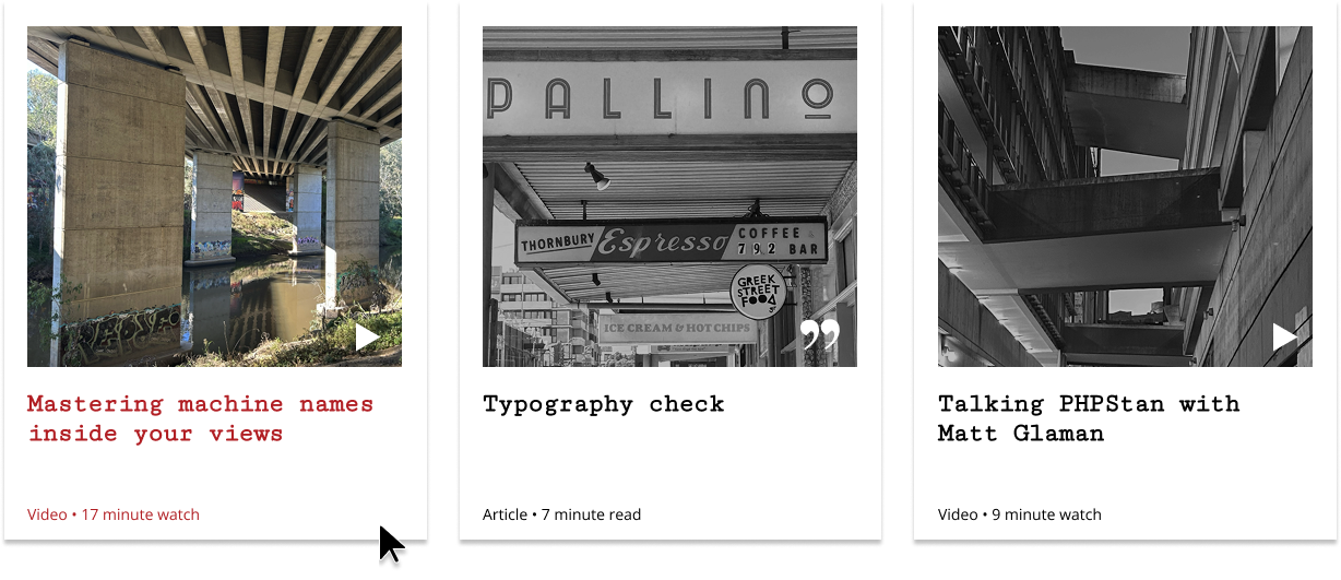
To highlight the founder’s passion for photography and add visual depth, personal snapshots were incorporated into background banners and listing tiles. The tiles themselves were styled to resemble Polaroids, with an engaging hover effect that transitions images from black and white to colour.
The final product, which is currently in development, successfully met the vision Free Sauce was seeking, providing users with a simple, intuitive interface while reflecting the playful nature of the brand behind the business.